Chart Types
Stock Market Charting
Stock market charting is used to analyze the price movement of stocks but charting is also applied to futures, commodities, forex, bonds etc. Charting of financial markets enable the user of the chart to analyze the price action and develop trading strategies based on this data. Most brokers now offer free charting and technical analysis features if they provide web based trading platforms.
The analysis of charts is a skill that can be developed with practice. Its a bit like reading the form. There is no guarantee you will be correct in interpreting a chart but it is surprising how you get used to the behaviour of a financial instrument. The more you study a market the more familiar you become with its behavioural characteristics, the types of moves it can make,what a “normal” chart looks like, what a market in panic looks like, even the way it “fools” the majority of traders. It is vital to get to know the market you trade like the back of your hand if you want to profit from it.
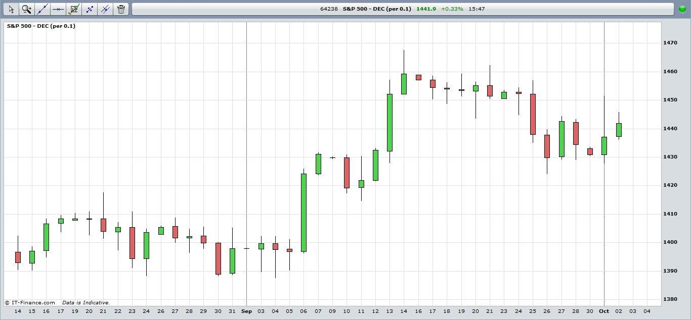
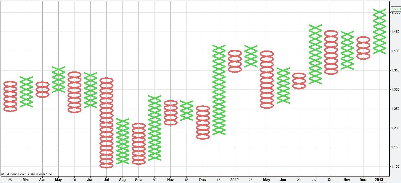
Below are popular ways of charting financial markets. Most of them are based on a daily bar chart of the S&P500 futures contract from mid-August to early October 2012.
A line chart connects past price points over a period of time with a straight line. Usually traders use the closing price of the given time period as it is considered the most important. The chart above tracks the daily closing price of the S&P500 futures contract each day. Line charts give a pretty basic view of past price movement and trend of the market.
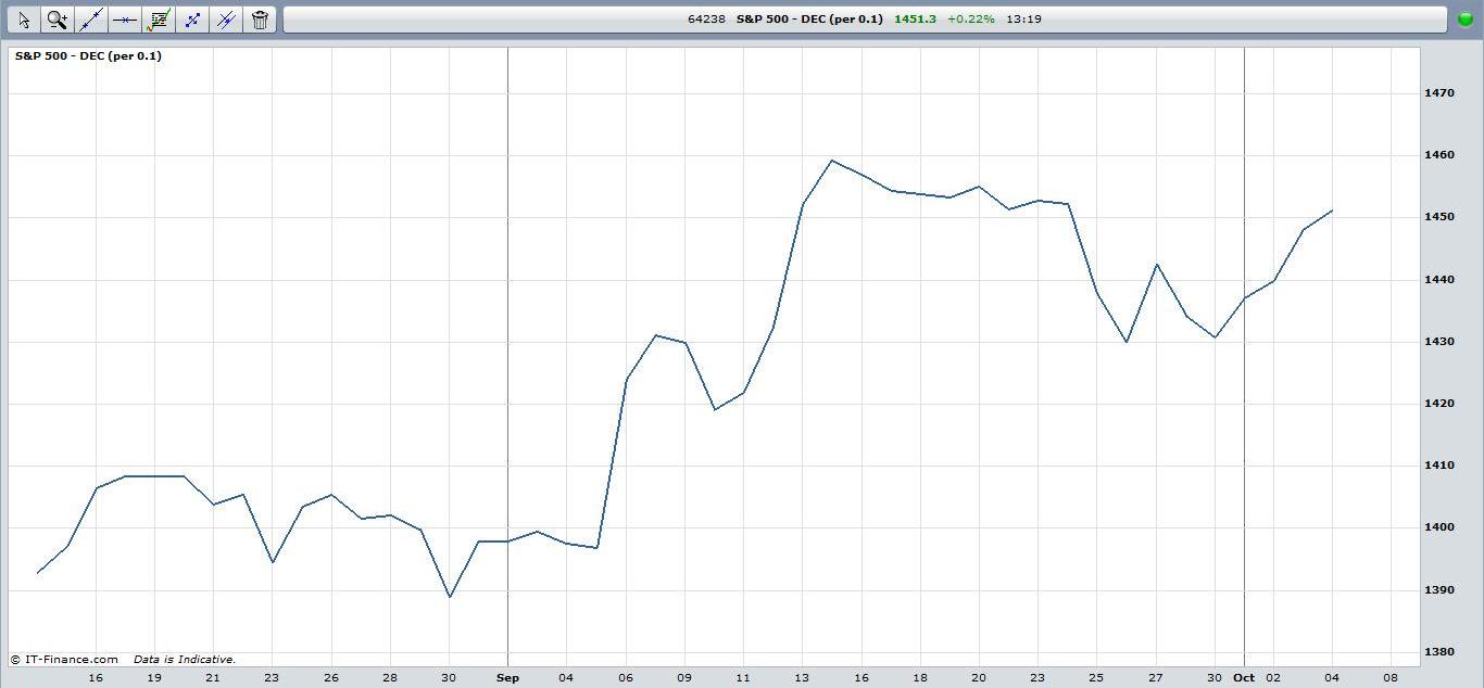
Stock Market Charting: View chart in interactive mode at ProRealTime.com.
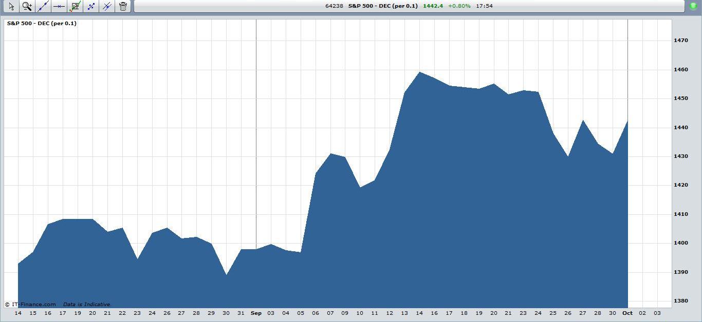
Sometimes you will see the line chart depicted as a mountain chart which is the same thing but with the lower half shaded.
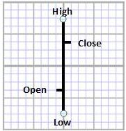
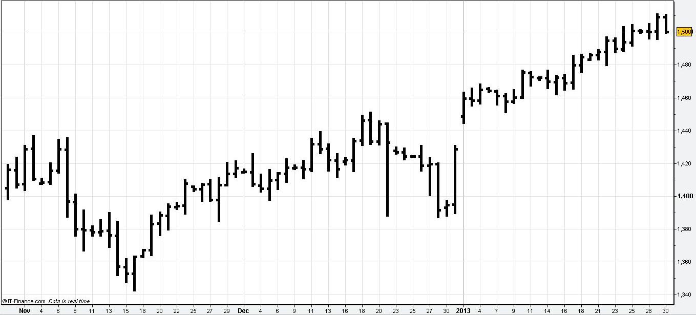
A bar chart shows the opening, highest, lowest and closing price of the time period being charted. The length of the bar is known as the day's range, the distance between the highest and lowest price that the market traded at during the day.
The following chart is a daily bar chart for the S&P500.
A candlestick chart is similar to the bar chart but the body of the candle is shaded red or green depending on whether the closing price is above or below the opening price.
A point and figure chart is unique in that it ignores time. The chart only moves when there is a significant move in price. This unit of price movement is determined by the person who constructs the chart. The advantage for the trader is that it eliminates insignificant price reversals that are below a minimum value. The choice of the price movement then is critical. An X or O is used to indicate that the price trend is up or down respectively. A new column only begins when the market reverses that minimum price unit. For example, if the trader decides that 1 dollar is the minimum price movement to record and a stock has been moving upwards, a new column will only start when the market moves at least 1 dollar downwards.
Return to Top of Stock Market Charting: Chart Types
Return to Technical Analysis Charts