Candlestick Charts Explained Part 2
Candlestick ChartsExplained: Candlesticks are widely used in trading financial markets. They can be employed in any time frame and any market including Stocks, Exchange Traded Funds, Currency Futures / Forex, Commodities and Bonds. They are also available on charting software of online trading firms providing access to Futures, Contracts for Difference (CFDs) or Spread Betting.
Many candlestick chart patterns exist to help traders interpret market movement. They should be used in context with the bigger picture. A single candlestick on its own is not a stand-alone signal to buy or sell. However, it can be a warning sign for traders when interpreted within a larger chart pattern.
Before we cover the different types of candlestick patterns, let’s take a step back and explore different types of individual candlesticks and what they can tell us about the ‘mood’ of market. Read Part 1 first if you haven’t covered it already.
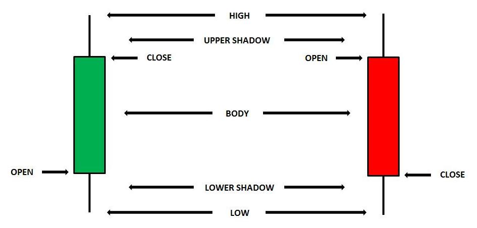
The chart below shows a standard green and red candle. The green candle shows a positive day on the market. The market closed significantly higher i.e. in the upper third of the day’s range. The range is the distance between the highest and lowest price. This means that there was more buying pressure than selling pressure. The ‘bulls’ won the day. The red candle represents a day when the selling pressure was greater because it closed in the lower part of the range. The ‘bears’ were in the ascendancy. The longer the candle is the stronger the buying or selling pressure.
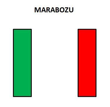
Sometimes a candle doesn’t have an upper or lower shadow. These are known as Marubozo candles. These are interpreted the same way as the standard candlestick but are an even stronger indication of positive or negative market sentiment. In the case of a green candle prices never declined below the open. In the case of a red candle the market never traded above the open. A green Marubozo candle represents a day when the market rises strongly from the open and closes right on the high of the day, a very bullish signal. The opposite is the case for a red Marubozo which is a very bearish signal.
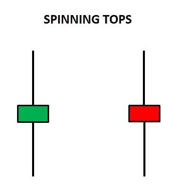
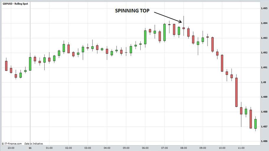
A spinning top candlestick represents a day when the market is indecisive. The colour of the candle is not important because the closing price is very close to the opening price. The shadows may be quite long meaning that prices moved up and down significantly during the day but ultimately could not sustain either direction. A spinning top can appear at any time so it is important to place it in context. A spinning top that appears in the middle of an upward or downtrend may just be some sideways action before the trend resumes. It can be interpreted as neutral. However, if it appears at an important resistance or support level, or potential top or bottom it is more significant. It could warn of a loss of market momentum and a possible reversal. Traders should wait for further confirmation before entering a trade.
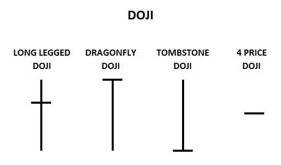
Doji candlesticks are days when the market closes at the same level (or very close) to the open. However, the Doji may be interpreted as bullish or bearish depending on where the open and close are in relation to the day’s range. The relevance of a doji depends on the preceding trend or preceding candlesticks. Once again, a doji that appears at a significant resistance, support level or top/bottom in the market is more significant than one that appears in the middle of a trend.
Long legged dojis have long shadows and represent indecision because the market closes at the same level as the open. A 4 price doji is rare. The market opens and closes at the same price and there is no shadow. The dragon fly doji may signify a reversal from a bottom because the market rallies from a steep daily decline to close strong near the highs of the day. A graveyard or tombstone doji signifies a potential top because the market rallies initially but turns down during the day and closes weak near the lows.
Candlestick Charts Explained
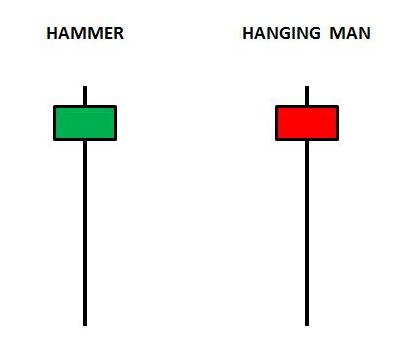
The hammer candlestick looks similar to a dragon fly doji. The only difference is that the hammer has a body. Once again, interpretation depends on the context. At an important support level, the hammer could signify a potential rally due to the strong close. A hanging man may appear if the market has rallied strongly to an important resistance level. What happens is that sellers push the price lower during the day and the buyers fight back but fail to push the market above the open or to new highs. Traders should wait for confirmation before going short because the trend is still up.
Candlestick Charts Explained
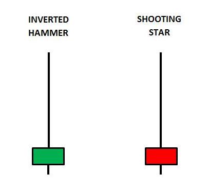
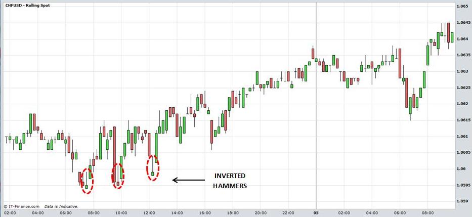
A shooting star can appear at a strong resistance level or potential top and could signify a reversal and move to the downside. The market opens and rallies to new highs. However, the market cannot sustain the price movement and prices decline to close below the open near the lows of the day. An inverted hammer may manifest at an important support level. It could be the beginning of a change in downward momentum but traders should wait for confirmation of an upward move to manifest before going long. The trend is still down.
Candlestick Charts Explained
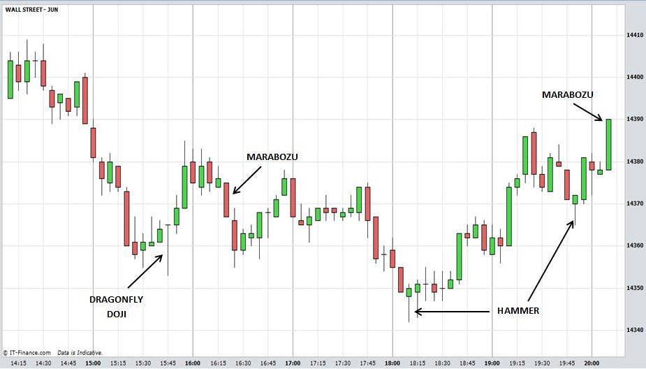
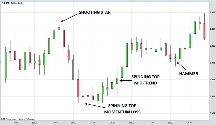
Below are examples of intra-day charts with some of the different types of candlesticks highlighted to aid comprehension.
Candlestick Charts Explained
Candlestick Charts Explained
Candlestick Charts Explained
Candlestick Charts Explained
The interpretation of candlesticks may seem complicated at first. Some of them appear quite similar, for example the spinning top and long legged doji. Rather than getting bogged down in the names of the candles try to interpret what the price action is saying about sentiment in the market.
Ask yourself, did the market close weak or strong relative to the open? With the odd exception, a strong close is usually interpreted as bullish and a weak close as bearish? Is the market near an important resistance or support level? What does the candle mean in this context? Is the candle indicating that the market will reverse from this resistance or support level as it has done in the past?
A trend trader may be looking to go long following a sharp retracement in an uptrend. Is the market potentially stabilising and going to resume the main trend? For example, if you use Fibonacci retracements, a hanging man at an important Fibonacci level is significant.
The point is that candlesticks, although useful in interpreting price action, are not stand alone indicators. They should be used in combination with chart patterns or other technical analysis indicators. Only then will you have a context with which to interpret them.
Return to Top of Candlestick
ChartsExplained : Part 2
Return to Candlestick Charts Part 1