Rectangles
Technical Analysis of Stock Markets
Technical Analysis of Stock Markets – Rectangles: Rectangles are easy to identify when analysing charts of financial markets. Other terms for this chart pattern are congestion, consolidation or trading range. The market fluctuates in a range between a higher price and lower price point in the security. In order for the market to develop a trading range it must meet resistance at the higher end of the range at least twice and find support at the lower end of the range at least twice. The highs are joined with a horizontal line and the lows with a parallel line.
During this phase the market is in a waiting phase, until the next move up or down. When the market breaks out of the trading range it can signify further movement in that direction.
As the pattern develops, traders using technical analysis of stock markets often go short when
the market meets the upper part of the range in anticipation that the market
will fall as it has done so before. Similarly, when the market reaches the
lower part of the range, some traders go long
expecting a rally. Of course, appropriate risk management and stop loss strategies should be implemented.
The pattern can last for any time frame but is usually at least a few weeks in the making. Often it is the case that the longer the time in congestion, the more significant the breakout that emerges. Volume may be high, signifying volatility and a real battle between buyers and sellers, or low signifying a quiet market and perhaps a lack of interest on the part of traders and investors. A breakout above or below the range has move conviction if it is accompanied with higher volume but false breakouts can occur. A false breakout is when the market breaks out above or below the range but reverses direction shortly afterwards. Because of this traders will often allow a percentage fluctuation around the upper and lower part of the range before deciding the breakout is genuine.
It is possible for rectangles to occur at the top or bottom of a market but they often occur in the middle of a trend and form a continuation rectangle. When the breakout occurs traders may enter in the direction of the breakout with a profit target equal to the range (height) of the rectangle
The daily candlestick chart of EUR/USD below demonstrates a continuation rectangle during an upward trend.
The market met resistance three times just under the 1.50 level on 23rd November 2007, 15th January and 1st February of 2008. Support was found around the 1.430 level twice in December 2007 and 22nd January 2008. Note that the market does not have to turn at the exact time price every time. We need to allow for some fluctuation around a price rather than an exact number. 3% is often used as a reasonable band of fluctuation.
Finally, on 26th February, after three months of congestion, the market broke out of the range and continued the previous upward trend to reach higher prices.
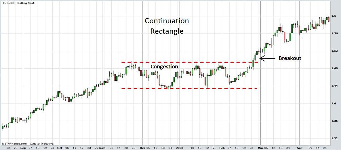
Technical Analysis of Stock Markets: Continuation Rectangle. View chart in interactive mode on ProRealTime.com
The next chart is of CRH PLC. Following a sustained downward trend the market made a low at 2186 on 22nd Nov 2007. Further lows around the same price formed on 10th, 16th and 22nd January 2008. Highs around the same price were formed on 11th December 2007 and 4th February 2008. The trading range narrowed further until finally a breakdown began on the 9th June 2008.
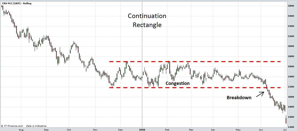
Technical Analysis of Stock Markets: Continuation Rectangle.
Rectangles can manifest in Stocks, Exchange Traded Funds, Forex, Commodities, Bonds, Futures, etc.
Return to Top of Technical Analysis of Stock Markets: Rectangles
Return to Technical Analysis Charts